The Dashboard Shift: A New Way to Present Data, Impact: Several new dashboards are blending data and storytelling in new ways
With the increasing demand to collect more metrics, many companies have struggled with how to sift through and present the data they gather.
Often these metrics get buried in annual reports or sit in excel files waiting for someone with the time and inclination to make sense of them. Data from which nothing is learned is wasted. At SOCAP 2011, Steve Wright, director of Social Performance Management at Grameen Foundation, shared his “8 rules of (social) enterprise efficacy measurement.” One of these rules is: metrics should be made public to encourage cooperation, alignment and emergence.
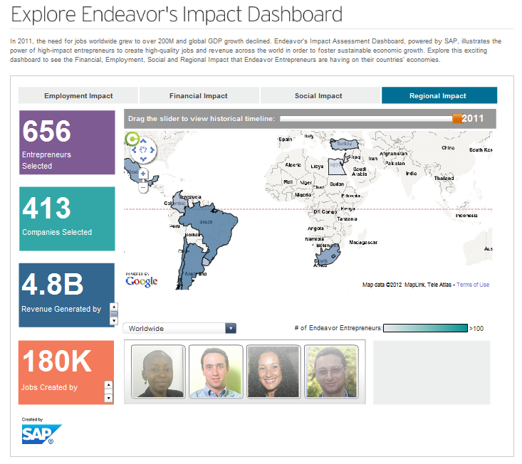
In recent months, several dashboards have emerged as a popular way to share metrics. Together with enterprise software giant SAP, Endeavor has built an impact assessment dashboard that visually demonstrates the kind of revenue and job growth their support elicits compared to the alternative. The dashboard combines internal data from Endeavor entrepreneur companies with international company-level data from the Enterprise Surveys of the World Bank. Key metrics include revenue growth, job creation, job satisfaction, employee income, and employee health and education benefits. Endeavor plans to use the dashboard to expand its work by demonstrating to potential partners the difference that high-impact entrepreneurs can have.
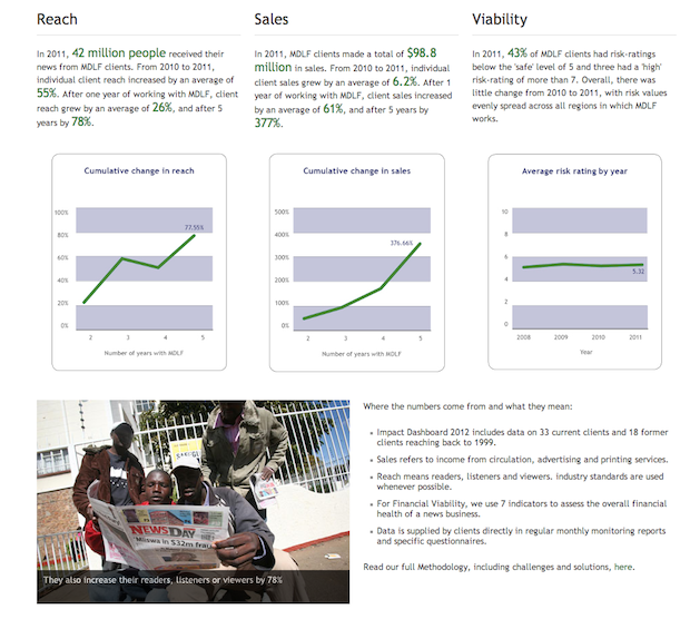
Meanwhile, The Media Development Loan Fund also recently released an impact dashboard. A more in-depth version of their impact dashboard can be downloaded here and their methodology can be downloaded here, a screenshot from the dashboard is below. Yet another impact dashboard worth checking out is Root Capital’s, which tracks their performance reports.
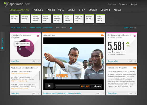
It seems like the days of sharing impact solely through anecdotal stories are drifting further away, which is undoubtedly a good thing. However, it’s important we don’t lose the additional context these stories provide. That’s the aim of Tomorrow Partners, which developed Sparkwise, a free and customizable platform for companies to tie such stories and data together visually. As founder Gaby Brink says: “Data alone doesn’t move you, data in a rich context does.” The platform, made possible by funding from the Bill & Melinda Gates Foundation has 10 goals, two of which include using data to self-analyze and share it between organizations in the similar sectors.
What strong examples have you seen of how to present data? How does your company share its data? What data do you like to see in dashboards? Please share via the comments section below.
- Categories
- Impact Assessment, Technology